Tag: Metrics

  • DL0121 Open-Loop vs Closed-Loop Validation

    Explain why open-loop validation metrics (e.g., MSE on offline trajectories) often fail to correlate with closed-loop success rates in physical robotics or driving environments.

    Answer

    Open-loop evaluation replays a logged trajectory and asks the policy to reproduce the expert action at states the expert visited, with ground-truth history fed back in at every step, so each prediction error is scored and then discarded. Closed-loop execution feeds every error into the next observation, so the policy’s own state distribution drifts off the demonstration manifold and errors compound: the classic behavior-cloning result turns a per-step error \epsilon into an excess cost of up to T^2 \epsilon over a T-step episode, a bound that is already vacuous for a 200-step driving episode at \epsilon = 0.01. Two further effects break the correlation before compounding even starts. MSE is mean-seeking: its minimizer is the conditional mean \mathbb{E}[a \mid s], and averaging the two valid modes of “swerve left or swerve right around the obstacle” produces a straight-line action that is optimal under the metric and a collision in the world. And metric mass is not risk mass: most logged frames are trivial lane-following, so average displacement error is dominated by how well a model extrapolates its own velocity, which is why an MLP fed only ego status with no perception input at all scored competitively on nuScenes open-loop L2 while being worthless as a planner.

    (1) Covariate Shift: open loop measures the loss under d_{\pi^*}, the expert’s state distribution, while success is determined under d_{\pi}, the policy’s own induced distribution; the two diverge as soon as the policy acts.
    (2) Compounding Error: teacher forcing caps the deviation at one step’s worth of error, whereas rollout integrates it, giving the quadratic-in-horizon gap that a single-step regression number cannot express.
    (3) Mode Averaging: a squared-error objective on a multimodal action distribution returns an interpolation of the modes, which is frequently the one infeasible action available.
    (4) Long-Tail Mismatch: safety outcomes are decided by a fraction of a percent of frames (cut-ins, occluded pedestrians, contact-rich grasps), and those frames contribute almost nothing to a dataset-averaged MSE.
    (5) Non-Reactive Logs: logged agents never yield, brake, or negotiate, so open loop cannot score any behavior whose correctness depends on how the world responds to the ego.
    (6) Shortcut Exploitation: ground-truth history leaks the answer; extrapolating the logged ego velocity minimizes displacement error without any scene understanding, and that shortcut vanishes the moment the policy controls its own history.

    Two panels: left shows a logged expert trajectory with short prediction-error arrows at each sampled state and the state reset to the log after every step; right shows the same per-step error accumulating into a rollout that curves away from the dashed expert reference into off-distribution states

    Figure 1: Open-loop scoring resets the policy onto the logged state after every prediction, so a bounded per-step error stays bounded; closed-loop rollout feeds each error into the next observation, and the visited states leave the training distribution where the policy has no guarantees at all.

    The theory is unusually clean here. Ross and Bagnell showed that supervised imitation with per-step loss \epsilon under the expert distribution admits an excess cost that grows as T^2 \epsilon, because a mistake at step t can put the agent in a state where it makes mistakes for all remaining T - t steps; on-policy correction such as DAgger restores the linear T \epsilon rate precisely by collecting labels on d_{\pi}. The practical consequence is that ranking two policies by offline \epsilon tells you almost nothing about their closed-loop ordering, since the multiplier between them differs by a factor of T and depends on recovery behavior that the offline data never contains. Codevilla and colleagues measured this directly on vision-based driving models and found offline prediction error to be a weak predictor of on-road driving quality, and the nuPlan and NAVSIM benchmarks were built specifically because open-loop leaderboard position stopped tracking closed-loop driving score.

    Mathematical Formulation:
    \epsilon = \mathbb{E}_{s \sim d_{\pi^*}}\left[\ell(s, \pi(s))\right]
    J(\pi) - J(\pi^*) \leq T^2 \epsilon
    \lVert d_{\pi} - d_{\pi^*} \rVert_1 \leq 2 T \epsilon
    \pi_{\mathrm{mse}}(s) = \mathbb{E}[a \mid s]
    \pi_{\mathrm{mse}}(s) = 0.5 a_L + 0.5 a_R

    Where:

    • \epsilon is the offline per-step error that an open-loop MSE actually reports, and \ell is the per-state surrogate loss (squared action error, displacement error).
    • \pi is the learned policy, \pi^* the expert, and J the closed-loop episode cost, with per-step cost bounded in [0, 1].
    • d_{\pi^*} and d_{\pi} are the state distributions induced by the expert and by the policy; open loop samples the first, deployment samples the second.
    • T is the episode horizon in control steps, the multiplier that an offline metric never sees; the bound becomes vacuous once T^2 \epsilon \geq T.
    • a_L and a_R are two equally valid expert modes (pass left, pass right) at the same state s; their MSE-optimal average drives straight into the obstacle.
    • Required condition for the bounds: the offline data is drawn from d_{\pi^*} with no on-policy correction, which is exactly the assumption behind pure behavior cloning.
    Log-scale chart of excess closed-loop cost against episode length T for a fixed per-step error of 0.01: the offline metric is a flat line at 0.01, on-policy correction grows linearly as T times epsilon, and behavior cloning grows quadratically as T squared times epsilon

    Figure 2: A single offline number \epsilon is consistent with wildly different closed-loop outcomes, because the horizon T is the multiplier and it is invisible to the metric; on-policy data collection is what changes the exponent from 2 to 1.

    PropertyOpen-loop replayClosed loop, log-replay agentsClosed loop, reactive agents or hardware
    States visitedExpert distribution onlyPolicy distribution, but in a world frozen to the logPolicy distribution with a world that responds to it
    Error feedbackNone; state is reset each stepEgo error compounds; other agents do not reactFull two-way feedback including other agents
    Typical metricAction MSE, ADE/FDE, L2 at 1/2/3 sRoute completion, collision rate, comfort sub-scoresTask success rate, interventions per kilometer or per trial
    Cost per evaluationOne forward pass per frame, fully parallel, secondsSequential rollout, hundreds of scenarios, minutes to hoursHighest; wall-clock hardware time or heavy sim agents
    Main blind spotRecovery, mode collapse to the mean, ego-status shortcutsFalse collisions from behind, merges and nudges scored unfairlySim-to-real gap in sensing, or low statistical power on real hardware

    Login to view more content
  • DL0094 Evaluating an LLM

    How do you evaluate an LLM?

    Answer

    There is no single number, so I treat evaluation as a stack of layers chosen to match how the model will actually be used: intrinsic likelihood (perplexity or bits per byte) at the bottom, static capability benchmarks above it, automated graders such as unit tests and LLM-as-judge, human pairwise preference, and finally an online A/B test on the real product metric. Each layer up the stack is closer to user value and more expensive, so cheap layers act as fast regression gates and expensive layers make ship decisions. The practical work is defining the task metric first, then building a private evaluation set drawn from production traffic, because public leaderboards measure a distribution that is rarely yours. Three things decide whether an evaluation is worth anything: contamination control, judge calibration against human labels, and error bars. Most reported “improvements” of one or two points on a 1000-item benchmark are inside the noise band and would not survive a paired significance test.

    (1) Start From The Deployment Task: a RAG assistant is scored on groundedness, citation precision, and refusal correctness, a coding model on pass@k against hidden tests, an agent on end-to-end task completion; a generic leaderboard score answers none of these.
    (2) Intrinsic Versus Extrinsic: perplexity is cheap and useful for pretraining and quantization regressions, but it is not comparable across tokenizers and correlates weakly with instruction-following quality.
    (3) Static Benchmarks Decay: MMLU-Pro, GPQA, MATH, HumanEval, and SWE-bench Verified are reproducible and cheap, but they saturate and they leak into pretraining corpora, so contamination checks (n-gram overlap, held-out variants, release-date filtering) are mandatory.
    (4) Automated Graders Scale, With Bias: the loop is sample responses → grade with a rubric or unit tests → aggregate with intervals; a judge model shows position, verbosity, and self-preference bias, so swap the answer order and calibrate agreement with humans before trusting it.
    (5) Human Preference Is The Open-Ended Gold Standard: pairwise votes fitted with a Bradley-Terry (Elo) model give a single latent quality score, at the cost of slow turnaround and annotator disagreement.
    (6) Report Uncertainty, Safety, And Cost: every score needs a confidence interval and a paired test against the baseline, plus a separate axis for jailbreak resistance, toxicity, PII leakage, and the p95 latency and cost per request that decide whether the win is affordable.

    Five stacked layers of LLM evaluation from intrinsic perplexity at the bottom through static benchmarks, automated graders, human preference, and production A/B testing at the top, with cost and fidelity increasing upward

    Figure 1: The evaluation stack. Cheap layers at the bottom run on every commit as regression gates; the expensive layers at the top are the only ones that measure user value, so a release decision needs evidence from both ends.

    Two failure modes dominate real evaluation work. The first is contamination: a model that has memorized a benchmark scores high without generalizing, which you detect by rewriting items into paraphrases or numeric variants and watching the score collapse, or by using benchmarks whose items post-date the training cutoff. The second is judge miscalibration: an LLM judge that prefers longer, more confidently worded answers will happily rank a verbose model above a correct one, so I always measure judge-human agreement (Cohen’s kappa above roughly 0.6 before the judge is allowed to gate a release) and control for response length. On top of that, generation is stochastic, so a benchmark run at temperature 0.7 has run-to-run variance of its own; fix seeds and decoding parameters, or report the mean over several runs. Finally, offline wins must be confirmed online, because the production metric that matters (resolution rate, edit distance to the accepted answer, escalation rate) frequently moves in the opposite direction from a benchmark score.

    PropertyStatic benchmarkLLM-as-judgeHuman preference
    What it measuresClosed-form correctness on a fixed item setRubric compliance and pairwise win rate on open-ended promptsLatent quality as perceived by real users or experts
    Turnaround per modelMinutes to hours, fully automatedHours, bounded by judge API throughput and costDays to weeks, bounded by annotator supply
    Main failure modeContamination and saturation; near-zero headroom on old suitesPosition, verbosity, and self-preference biasAnnotator disagreement and prompt-mix drift
    ReproducibleYes, if decoding and prompt template are pinnedOnly against a pinned judge version; judge upgrades shift scoresNo, each round is a fresh sample of raters
    Best used forCI regression gates and capability screeningScaling open-ended comparison between candidate checkpointsFinal ranking and calibrating the automated judge

    Mathematical Formulation:
    \mathrm{PPL} = \exp\left(-\frac{1}{T}\sum_{t=1}^{T}\log p(x_t \mid x_{1:t-1})\right)
    \mathrm{pass@}k = 1 - \frac{\binom{n-c}{k}}{\binom{n}{k}}
    P(a \succ b) = \frac{1}{1 + 10^{(R_b - R_a)/400}}
    \mathrm{SE} = \sqrt{\frac{\hat{p}(1-\hat{p})}{N}}

    Where:

    • \mathrm{PPL} is perplexity over a held-out sequence x_1,\ldots,x_T, with t indexing tokens; it depends on the tokenizer, so bits per byte is the cross-model comparable form.
    • n is the number of samples drawn per coding problem, c the number that pass the hidden tests, and k the budget of attempts scored; this is the unbiased pass@k estimator, averaged over problems.
    • P(a \succ b) is the modelled probability that response a beats b, and R_a, R_b are the fitted Bradley-Terry ratings on the Elo scale, where a 100-point gap implies about a 64% win rate.
    • \hat{p} is the observed accuracy on N independent items and \mathrm{SE} its standard error; the 95% interval is \hat{p} \pm 1.96\,\mathrm{SE}, which for \hat{p}=0.7 and N=1000 is roughly \pm 2.8 points.
    • Required condition: items must be independent and not contaminated; when two models are scored on the same items, use a paired test (McNemar or a paired bootstrap) rather than comparing two independent intervals.
    Bar chart of three model accuracies of 71.2, 73.5 and 78.9 percent on a 1000-item benchmark with 95 percent confidence interval error bars of about 2.8 points, showing the first two intervals overlapping

    Figure 2: Accuracy with 95% intervals on a 1000-item benchmark. The 2.3-point gap between the first two models sits well inside the noise band, so an unpaired claim of improvement is unsupported; only the third model separates cleanly.


    Login to view more content
  • ML0036 Confusion Matrix

    In which scenarios is a Confusion Matrix most useful for evaluating machine learning models, and why?

    Answer

    A confusion matrix tabulates a classifier’s predictions against the true labels (in the binary case the four counts TP, FP, FN, and TN), so it exposes not just how many errors a model makes but which kinds. It earns its place whenever a single scalar metric would hide something important. On imbalanced datasets it reveals whether the minority class is actually being found: a model scoring 95% accuracy by mostly ignoring a 5% class is exposed instantly by its minority row. When error types have different costs (medical screening, fraud detection), the FP and FN cells let you weigh false alarms against misses explicitly. In multi-class problems, off-diagonal clusters show which specific classes the model confuses, guiding targeted fixes. It is also the right tool for model comparison beyond one metric, and for stakeholder communication: “we caught X% of positives while mis-flagging Y% of negatives” makes trade-offs concrete for non-technical audiences.

    (1) Imbalanced Data: Minority-class performance is visible row by row; accuracy alone would hide it.
    (2) Asymmetric Costs: FP and FN are separated, so false-alarm vs miss trade-offs can be tuned deliberately.
    (3) Diagnosis: Multi-class off-diagonals show exactly which classes get confused; four-quadrant views communicate clearly to stakeholders.

    Binary confusion matrix heatmap with counts on the diagonal and small off-diagonal errors

    Figure 1: A binary confusion matrix: the strong diagonal (87 and 89 correct) shows a healthy classifier, while the small off-diagonal cells (10 false alarms, 14 misses) quantify the two error types separately, information accuracy alone cannot give.

    Mathematical Formulation:
    M_{ij} = \sum_{k=1}^{N} \mathbb{1}\big(y_k = i,\; \hat{y}_k = j\big)
    \text{precision} = \frac{TP}{TP + FP}
    \text{recall} = \frac{TP}{TP + FN}
    \text{accuracy} = \frac{TP + TN}{N}

    Where:

    • M_{ij} counts samples whose true class is i and predicted class is j; \mathbb{1}(\cdot) is the indicator function.
    • TP, FP, FN, TN are the four binary cells: correct positives, false alarms, misses, and correct negatives.
    • Every standard classification metric is an arithmetic combination of the cells: the matrix is the source, the metrics are views of it.

    Login to view more content
  • ML0016 AUC

    What is AUC?

    Answer

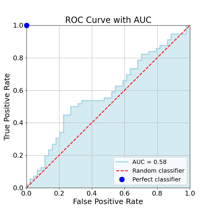
    AUC (Area Under the Curve) measures a binary classifier’s ability to distinguish between the positive and negative classes, computed as the area under its ROC curve, the curve that trades off true positive rate against false positive rate across all thresholds. Its value ranges from 0 to 1: 1.0 is a perfect classifier, 0.5 is random guessing (the diagonal), and below 0.5 is worse than random, which rarely happens and can be flipped into a better model. AUC’s advantages: it is threshold-independent, summarizing performance over every decision threshold at once; it handles imbalanced data well because it evaluates the ranking of predictions rather than absolute counts; and it gives an intuitive single number for comparing different models.

    (1) Definition: The area under the ROC curve: one scalar summarizing threshold-free discrimination.
    (2) Probabilistic Meaning: AUC equals the probability that a random positive scores higher than a random negative.
    (3) Reading The Scale: 1.0 perfect, 0.5 random, below 0.5 inverted.

    ROC curve with the area under it shaded and AUC value labeled

    Figure 1: AUC is literally the shaded area under the ROC curve; the wider the curve bows toward the top-left corner, the larger the area.

    Mathematical Formulation:
    \text{AUC} = P\big(s(x^{+}) > s(x^{-})\big)
    \text{AUC} = \int_{0}^{1} \text{TPR}(\text{FPR}) \, d\text{FPR}

    Where:

    • s(x) is the model’s score (e.g., predicted probability) for sample x.
    • x^{+} is a randomly chosen positive sample and x^{-} a randomly chosen negative one.
    • \text{TPR}(\text{FPR}) is the ROC curve itself, true positive rate as a function of false positive rate.
    • The two lines are equivalent: the geometric area (integral) equals the pairwise-ranking probability, which is why AUC measures ranking quality.

    Login to view more content
  • ML0015 ROC Curve

    What is the ROC Curve, and how is it plotted?

    Answer

    The ROC (Receiver Operating Characteristic) curve is a graphical tool for evaluating a binary classifier by plotting the true positive rate against the false positive rate at every classification threshold. Because models output scores rather than hard labels, a threshold decides what counts as positive; sweeping that threshold from strict to lenient traces out the curve. To plot it: train the binary classifier, generate probability scores for the positive class, compute TPR and FPR at many threshold values, then plot TPR versus FPR. Reading the curve: points near the top-left corner mean high TPR with low FPR: excellent performance; the diagonal is random guessing; curves below the diagonal are worse than random (and can be flipped to beat it); a perfect classifier sits at the single point (0, 1).

    (1) Axes: Y is TPR (recall, sensitivity); X is FPR (1 − specificity); both sweep with the threshold.
    (2) How It Is Built: Score the data, then recompute the confusion counts at every candidate threshold and connect the points.
    (3) Reading It: Closer to the top-left corner is better; the diagonal is random; (0, 1) is perfect.

    ROC curves for better than random, worse than random, random, and perfect classifiers

    Figure 1: Reference ROC curves: the further a model bows toward the top-left corner, the better it ranks positives above negatives.

    Mathematical Formulation:
    \text{TPR}(\tau) = \frac{TP(\tau)}{TP(\tau) + FN(\tau)}
    \text{FPR}(\tau) = \frac{FP(\tau)}{FP(\tau) + TN(\tau)}

    Where:

    • \tau is the classification threshold; varying it from 1 down to 0 traces the curve.
    • TP(\tau), FP(\tau), FN(\tau), and TN(\tau) are the confusion-matrix counts at threshold \tau.
    • \text{TPR} is the true positive rate (same as recall) and \text{FPR} is the false positive rate, the curve’s two axes.

    Login to view more content
  • ML0014 Confusion Matrix

    What is the confusion matrix?

    Answer

    A confusion matrix is a table that summarizes the performance of a classification model by comparing its predicted labels against the actual labels. For binary classification it is a 2×2 table with four cells: true positives (correctly predicted positive), false positives (negative predicted as positive), false negatives (positive predicted as negative), and true negatives (correctly predicted negative). Unlike a single scalar metric, it shows not only how many predictions were wrong but which kinds of errors were made. For multi-class problems, the matrix expands into a larger square table where cell (i, j) counts the instances of actual class i predicted as class j; off-diagonal clusters reveal which specific classes the model systematically confuses, guiding model refinement or relabeling.

    (1) Structure: Rows are actual classes, columns are predicted classes; the diagonal holds all correct predictions.
    (2) Binary Case: The four cells TP/FP/FN/TN feed every classification metric: accuracy, precision, recall, F1.
    (3) Multi-Class Case: An n \times n matrix whose off-diagonal hotspots expose systematic class confusions.

    Actual \ PredictedPredicted PositivePredicted Negative
    Actual PositiveTrue Positives (TP): correct positiveFalse Negatives (FN): missed positive
    Actual NegativeFalse Positives (FP): false alarmTrue Negatives (TN): correct negative

    Mathematical Formulation:
    M_{ij} = \sum_{k=1}^{N} \mathbb{1}\big(y_k = i,\; \hat{y}_k = j\big)
    \text{row-normalized:} \quad \tilde{M}_{ij} = \frac{M_{ij}}{\sum_j M_{ij}}

    Where:

    • M_{ij} is the count in row i, column j of the confusion matrix.
    • y_k is the true label of sample k, \hat{y}_k its predicted label, and k\in\{1,\ldots,N\} indexes the N samples.
    • \mathbb{1}(\cdot) is the indicator function: 1 when the condition holds, 0 otherwise.
    • \tilde{M}_{ij} is the row-normalized version: row i then shows the per-class recall distribution, which reads better under class imbalance.
    Three class confusion matrix heatmap with off-diagonal confusions

    Figure 1: A 3-class example: strong diagonal means healthy classification; the bright off-diagonal cell shows the model systematically confuses class 1 with class 2.


    Login to view more content
  • ML0013 Accuracy

    What is accuracy?

    Answer

    Accuracy is a metric that evaluates a classification model as the ratio of correct predictions to the total number of predictions: if a model classifies 99 of 100 samples correctly, its accuracy is 99%. It is intuitive and widely used because it directly answers “how often is the model right?” The four outcomes behind it are: true positives (positive correctly predicted), true negatives (negative correctly predicted), false positives (negative predicted as positive), and false negatives (positive predicted as negative). The important caveat: accuracy alone can be misleading on imbalanced data: a model that labels every patient “healthy” scores 99% on a dataset with 1% disease prevalence while being clinically useless. In such cases, precision, recall, and the F1 score give a truer picture.

    (1) Definition: Correct predictions divided by all predictions, simple and intuitive.
    (2) When It Works: Roughly balanced classes and symmetric error costs.
    (3) The Accuracy Paradox: On skewed data, a trivial “always predict the majority” model scores high accuracy with zero real skill.

    Grid of 100 samples with 90 majority class showing the trivial 90 percent accuracy paradox

    Figure 1: The accuracy paradox: with 90 negatives and 10 positives, predicting “negative” for everything yields 90% accuracy while catching zero positives.

    Mathematical Formulation:
    \text{Accuracy} = \frac{TP + TN}{TP + TN + FP + FN}

    Where:

    • TP and TN are the counts of correct positive and negative predictions: the numerator counts everything the model got right.
    • FP and FN are the false alarm and miss counts; the denominator is simply the total number of samples.
    • Because TN dominates on imbalanced data, high accuracy can hide a model that never identifies the minority class at all.

    Login to view more content
  • ML0012 F1 Score

    What is F1 Score?

    Answer

    The F1 score is a metric for classification models that combines precision and recall into a single number, and it is particularly useful when classes are imbalanced. It is the harmonic mean of the two: precision measures how many positive predictions are correct, recall measures how many actual positives are found, and the harmonic mean punishes imbalance between them: a high F1 requires both to be high at once. A model with 99% precision but 10% recall scores poorly on F1, because the harmonic mean is dominated by the smaller of the two values. This makes F1 a stricter, more informative summary than accuracy or either component alone when false positives and false negatives both matter.

    (1) Definition: The harmonic mean of precision and recall, one number summarizing both.
    (2) Key Property: It is dominated by the lower component, so it cannot be gamed by maximizing only precision or only recall.
    (3) When To Use: Imbalanced classes, or when false positives and false negatives carry comparable cost.

    F1 score contour lines over the recall-precision plane

    Figure 1: F1 contour lines over the recall–precision plane: to reach a higher F1 band you must improve both metrics: moving along one axis alone quickly flattens out.

    Mathematical Formulation:
    \text{F1} = \frac{2 \times \text{Precision} \times \text{Recall}}{\text{Precision} + \text{Recall}}
    \text{F1} = \frac{2TP}{2TP + FP + FN}

    Where:

    • \text{Precision} is TP/(TP+FP) and \text{Recall} is TP/(TP+FN) (see the precision-and-recall question).
    • TP, FP, and FN are the true positive, false positive, and false negative counts.
    • The second line is the equivalent counts-only form; TN does not appear, which is why F1 stays meaningful under class imbalance.

    Login to view more content
  • ML0011 Precision and Recall

    What are Precision and Recall?

    Answer

    Precision and recall are two fundamental metrics for evaluating classification models, especially with imbalanced data or asymmetric error costs. Precision (positive predictive value) is the ratio of correctly predicted positives to all predicted positives: it answers “when the model says positive, how often is it right?” If a spam detector flags 100 emails and 99 are truly spam, precision is 99%. Recall (sensitivity, true positive rate) is the ratio of correctly predicted positives to all actual positives: it answers “of all the real positives, how many did the model catch?” If 100 spam emails exist and the model finds 90, recall is 90%. High precision means few false alarms (a spam filter that almost never marks good mail as spam); high recall means few misses (a cancer screening that almost never misses a real case). The two metrics sit on a trade-off controlled by the decision threshold.

    (1) Precision = Accuracy Of Positive Predictions: Minimizing false positives matters when false alarms are costly.
    (2) Recall = Coverage Of Actual Positives: Minimizing false negatives matters when misses are costly.
    (3) Trade-Off: Lowering the classification threshold raises recall and usually lowers precision; raising it does the reverse.

    Set diagram of relevant and retrieved items showing TP, FP, and FN regions

    Figure 1: The set view: precision is the share of the retrieved set that is correct, recall is the share of the relevant set that was retrieved.

    Mathematical Formulation:
    \text{Precision} = \frac{TP}{TP + FP}
    \text{Recall} = \frac{TP}{TP + FN}

    Where:

    • TP (true positives) is the count of positives correctly predicted as positive.
    • FP (false positives) is the count of negatives wrongly predicted as positive, the false alarms.
    • FN (false negatives) is the count of positives wrongly predicted as negative, the misses.
    • TN (true negatives) is the count of negatives correctly predicted as negative; it enters neither formula, which is why these metrics shine on imbalanced data.

    Login to view more content