Tag: Data

  • ML0100 Duplicate Detection

    How do you detect and handle duplicates in a dataset, from exact matching to NVIDIA NeMo Curator’s GPU-accelerated fuzzy deduplication?

    Answer

    Duplicate detection has two levels: exact duplicates (identical rows or records) and near-duplicates (small edits, reformatting, or paraphrases). Exact duplicates are found by hashing: compute a hash (MD5, SHA) of each row or document, group by hash, and flag collisions in O(n) time. Near-duplicates are harder and require similarity-based methods: MinHash converts each document into a set of shingles and estimates the Jaccard similarity via shared min-hash signatures, then Locality-Sensitive Hashing (LSH) buckets signatures so that similar documents collide in the same bucket, reducing the O(n^2) all-pairs comparison to near-linear. NVIDIA NeMo Curator provides GPU-accelerated fuzzy deduplication using MinHash and LSH, and the research framework SEDD pushes this further by replacing data shuffling with streaming, reaching 158x over CPU-based SlimPajama tooling and 7.8x over NeMo Curator while deduplicating 1.2 trillion tokens in 3 hours on a 32-GPU cluster. LSHBloom replaced the expensive LSH index with Bloom filters, achieving 12x speedup and 18x less disk space at the same deduplication quality.

    (1) Exact Duplicates: hash each row or document, group by hash, flag collisions; O(n) time, zero false positives; handles identical rows, copy-paste records, and repeated data entries.
    (2) Near-Duplicates (MinHash + LSH): shingle each document, compute MinHash signatures (k random permutations), bucket via LSH so similar documents collide, then verify candidate pairs by exact Jaccard similarity; reduces O(n^2) all-pairs to near-linear.
    (3) Production Scale: NVIDIA NeMo Curator supplies the GPU MinHash LSH baseline, and SEDD deduplicates 1.2 trillion tokens in 3 hours on a 32-GPU cluster (158x over CPU tooling, 7.8x over NeMo Curator) while keeping Jaccard similarity above 0.95; LSHBloom replaces the LSH index with Bloom filters for 12x speedup and 18x less disk space at internet scale.

    Two-tier pipeline: top tier shows exact dedup via hashing (hash each row, group by hash, flag collisions); bottom tier shows near-duplicate dedup via shingling, MinHash signatures, LSH bucketing, and Jaccard verification

    Figure 1: The two-tier deduplication pipeline: exact duplicates are found by hashing and grouping (O(n), zero false positives), while near-duplicates use shingling, MinHash signatures, and LSH bucketing to reduce the O(n^2) all-pairs comparison to near-linear.

    Duplicates matter because they inflate evaluation metrics and bias the model. If the same example appears in both training and test sets, the model memorizes it during training and gets it right at test time, producing an accuracy estimate that will not hold on truly unseen data. Even within the training set alone, duplicates cause the model to over-weight those examples, effectively up-sampling them. The handling strategy depends on the duplicate type: exact duplicates within one split should be removed; cross-split duplicates (train-test contamination) require deduplication before the split; near-duplicates in LLM training corpora are removed at scale to prevent memorization and recitation, which is why NVIDIA NeMo Curator and HuggingFace’s datasets deduplication tools exist. For structured tabular data, pandas’ drop_duplicates() handles exact duplicates, and fuzzy matching libraries (recordlinkage, dedupe) handle near-duplicates via string similarity. For text corpora at scale, MinHash LSH is the standard, and GPU acceleration made it practical for trillion-token pretraining datasets.

    Mathematical Formulation:
    J(A, B) = \frac{|A \cap B|}{|A \cup B|}
    P[\min(\pi(A)) = \min(\pi(B))] = J(A, B)
    s(x) = (h_1(x), h_2(x), \ldots, h_k(x))

    Where:

    • J(A, B) is the Jaccard similarity between two sets A and B (e.g., the shingle sets of two documents); near-duplicates have Jaccard similarity above a threshold (typically 0.8-0.9).
    • \pi is a random permutation of the universe; the MinHash property states that the probability of two sets sharing the same minimum hash value equals their Jaccard similarity, so averaging over k permutations gives an unbiased estimate.
    • s(x) is the MinHash signature of document x: a vector of k minimum hash values. LSH buckets signatures so that similar signatures (and thus similar documents) collide with high probability, reducing candidate pairs from O(n^2) to near-linear.
    MethodDuplicate TypeComplexityScale
    Hashing (exact)Exact duplicatesO(n)Any (pandas drop_duplicates)
    MinHash + LSHNear-duplicates (text)O(nk) + candidate verificationMillions of documents
    GPU MinHash LSH (NeMo Curator, SEDD)Near-duplicates (GPU)GPU-parallelized MinHash LSH1.2T tokens in 3 hours (32 GPUs, SEDD)
    LSHBloomNear-duplicates (Bloom)O(nk), 12x faster than LSHInternet-scale (billions of docs)

    Login to view more content
  • ML0099 Noisy Labels

    How would you detect and correct inconsistent or noisy labels in training data?

    Answer

    Noisy labels are training labels that are wrong or inconsistent: a dog image labeled “cat,” a sentiment review labeled “positive” that is clearly negative, or the same entity labeled differently by different annotators. Detection starts with Confident Learning, a model-agnostic framework that uses cross-validated predicted probabilities to estimate the joint distribution between noisy labels and true labels, then flags examples where the model’s confident prediction disagrees with the given label. The open-source Cleanlab library implements this and has surfaced over 100,000 label issues in ImageNet. Correction ranges from simple relabeling (flip the label if the model is very confident) to weak supervision (using foundation models as labeling functions and denoising their outputs via a label model), to noise-robust training (CANOLA, 2026, achieves 19-52% improvement over SOTA label correction via noise-aware learning and iterative soft label refinement). Confident Learning is now taught as a core data-centric AI technique, and the original framework was published in JAIR 2021.

    (1) Detection via Confident Learning: cross-validate the model to get out-of-sample predicted probabilities, estimate the joint distribution of noisy vs true labels, and flag examples where the predicted label confidently disagrees with the given label; Cleanlab surfaced 100,000+ label issues in ImageNet this way.
    (2) Correction via Weak Supervision: foundation models (Llama 3.1, GPT-4, CLIP) serve as labeling functions that produce noisy labels, then a label model denoises them by learning each function’s precision and correlations, achieving 19.5% error reduction over zero-shot on the WRENCH benchmark.
    (3) Correction via Noise-Aware Training: instead of hard relabeling, use soft labels (probability distributions over classes) refined iteratively during training; CANOLA (2026) achieves 19-52% relative improvement over SOTA, and the Relabeler framework (2026) achieves 58% improvement in label correction precision by jointly leveraging local and global data relationships.

    Pipeline: cross-validated model produces out-of-sample probabilities, Confident Learning estimates the noisy-vs-true joint distribution and flags disagreements, then correction routes to relabel, weak supervision, or noise-aware soft-label training

    Figure 1: The noisy-label pipeline: cross-validated predictions feed Confident Learning to detect label errors via the noisy-vs-true joint distribution, then correction routes to manual relabeling, weak supervision, or noise-aware soft-label training.

    The detection step relies on a key insight: if a well-trained model confidently predicts “dog” for an image labeled “cat,” the label is more likely wrong than the model. Confident Learning formalizes this by estimating the joint distribution P(\tilde{y}, y^*) of observed (noisy) labels and true labels using the cross-validated probability matrix, then identifying the most likely mislabeled examples via pruning, counting, and ranking. This requires no hyperparameters and works with any classifier. For correction, the simplest approach is to remove or relabel the flagged examples if you have access to a human annotator. If human annotation is expensive, weak supervision lets you define labeling functions as natural-language prompts to foundation models, and the label model combines their outputs by learning each function’s accuracy and correlations. For training-time correction, noise-aware methods like CANOLA replace hard labels with soft labels (class probability distributions) that are refined iteratively, avoiding the hard commitment of relabeling while reducing the impact of noise. A 2026 paper on spectral signatures showed that the tail index of eigenvalue distributions at network bottleneck layers predicts test accuracy under label noise with R-squared of 0.984, providing a diagnostic that identifies 9% noise in CIFAR-10N with 3% error.

    A three-by-three matrix for classes cat, dog and bird: rows are the given noisy labels and columns the model's confident predictions, each row summing to 1, with green diagonal cells for agreement and red off-diagonal cells marking likely mislabeled examples

    Figure 2: Row-normalized rates of confident predictions given each noisy label: off-diagonal mass is the estimated per-class mislabeling rate, and Confident Learning turns these confident counts into the noisy-versus-true joint distribution used to prune, count, and rank label errors.

    Mathematical Formulation:
    \hat{P}(\tilde{y}=i,\, y^*=j) = \frac{1}{n}\sum_{k=1}^{n} \mathbb{1}[\tilde{y}_k = i] \cdot \mathbb{1}[\hat{p}_j(x_k) \geq t_j]
    \hat{y}^*_k = \arg\max_j \hat{p}_j(x_k)

    Where:

    • \hat{P}(\tilde{y}=i,\, y^*=j) is the estimated joint distribution of the noisy label \tilde{y} and the true label y^*; \hat{p}_j(x_k) is the cross-validated predicted probability of class j for example k.
    • t_j is the average per-class confidence threshold (the average self-confidence for class j); examples where \hat{p}_j(x_k) \geq t_j but \tilde{y}_k \neq j are flagged as likely mislabeled.
    • \hat{y}^*_k is the Confident Learning estimate of the true label: the argmax of the cross-validated probabilities, used for relabeling or soft-label assignment in noise-aware training.
    MethodApproachRequires Labels?
    Confident Learning (Cleanlab)Cross-validated probabilities estimate noisy-vs-true joint distributionNoisy labels only
    Weak SupervisionFoundation models as labeling functions; label model denoisesNo labels needed; optional ground truth
    Noise-Aware Training (CANOLA)Iterative soft-label refinement during trainingNoisy labels only
    Spectral Signatures (2026)Eigenvalue tail index at bottleneck layers predicts noise levelDiagnostic; no labels needed

    Login to view more content
  • ML0098 Outlier Detection

    How do you detect outliers in a dataset, from simple statistical rules to Isolation Forest and beyond?

    Answer

    Outlier detection ranges from simple statistical rules to model-based methods, and the right choice depends on the data dimensionality, distribution, and whether you have labels. For univariate data, the two standard rules are the z-score method (flag points more than 2 or 3 standard deviations from the mean) and the IQR rule (flag points below Q1 – 1.5*IQR or above Q3 + 1.5*IQR); the IQR rule is more robust because the mean and std are themselves inflated by outliers. For multivariate and high-dimensional data, statistical rules break down, and model-based methods take over: Isolation Forest isolates anomalies by random splits (outliers need fewer splits to isolate), Local Outlier Factor (LOF) compares local density to neighbors, and autoencoders flag points with high reconstruction error. Production data quality tools combine Isolation Forest for anomaly detection with robust statistics (median plus 5 times the robust standard deviation) for per-column outlier flagging, and a 2024 PMLR paper introduced HPOD, the first continuous hyperparameter search method for unsupervised outlier detection, achieving 58% and 66% improvement over default LOF and Isolation Forest hyperparameters.

    (1) Statistical (Univariate): z-score flags points beyond 2-3 sigma from the mean; IQR flags points outside Q1 – 1.5*IQR to Q3 + 1.5*IQR; IQR is robust to the outliers themselves, z-score is not.
    (2) Model-Based (Multivariate): Isolation Forest isolates anomalies with fewer random splits (O(n log n), scales well); LOF compares local density to k-nearest neighbors (O(n^2) naive, good for local anomalies); autoencoders flag high reconstruction error (good for complex distributions but needs training data).
    (3) Production (Data Quality Tools + HPOD): production data quality reports use Isolation Forest with anomaly scores plus robust per-column statistics (median plus or minus 5*RSTD); HPOD (PMLR 2024) capitalizes on prior benchmark performance to tune LOF and Isolation Forest hyperparameters without labels, improving detection by 58-66%.

    Four panels: z-score shows a bell curve with the tails beyond plus and minus 3 sigma shaded and labelled flagged; IQR shows a horizontal boxplot with outliers drawn as X markers past the whiskers; Isolation Forest shows a two-feature scatter where far-from-centre points are marked as isolated; LOF shows two dense clusters with a single low-local-density point between them marked

    Figure 1: Four outlier detection methods: z-score flags points beyond 3 sigma (sensitive to outliers itself), IQR uses the interquartile range (robust), Isolation Forest isolates anomalies with few random splits, and LOF compares local density to neighbors.

    The practical workflow is to start simple and escalate. First, visualize: boxplots per feature and scatter plots of feature pairs reveal obvious outliers. Second, apply the IQR rule per feature for a quick, robust baseline. Third, for multivariate outliers that no single feature reveals, run Isolation Forest (scales to high dimensions, O(n log n), no distributional assumption) and inspect the anomaly score distribution. Fourth, if anomalies are local (dense regions with sparse sub-regions), use LOF. Fifth, for complex nonlinear structure (images, text embeddings), train an autoencoder on the majority class and flag high reconstruction error. Always investigate flagged points before removing them: an outlier may be a genuine rare event (fraud, anomaly) rather than bad data, and domain expertise is the final arbiter. Production data quality tools automate this by generating a Data Quality and Insights Report that combines Isolation Forest anomaly scores with per-column robust statistics and time-series decomposition for temporal anomalies.

    Mathematical Formulation:
    z_i = \frac{x_i - \mu}{\sigma},\quad |z_i| > 3 \Rightarrow \text{outlier}
    \text{IQR} = Q_3 - Q_1,\quad x_i \leq Q_1 - 1.5\,\text{IQR} \;\text{or}\; x_i \geq Q_3 + 1.5\,\text{IQR} \Rightarrow \text{outlier}
    s(x, n) = 2^{-\mathbb{E}[h(x)]\,/\,c(n)}

    Where:

    • z_i is the z-score of point x_i; \mu and \sigma are the mean and standard deviation of the feature. The z-score method is not robust because outliers inflate \mu and \sigma, masking themselves.
    • Q_1 and Q_3 are the 25th and 75th percentiles; the IQR rule is robust because percentiles are unaffected by extreme values. A related robust rule used in production: flag values outside median plus or minus 5 times the robust standard deviation (RSTD).
    • s(x, n) is the Isolation Forest anomaly score. \mathbb{E}[h(x)] is the average path length needed to isolate x across the trees and c(n) is the expected path length for n points, so outliers isolate in fewer splits, which drives the exponent up and pushes s toward 1, while normal points sit near 0.5 or below.
    MethodTypeComplexityBest For
    z-scoreUnivariate, parametricO(n)Approximately normal data
    IQR ruleUnivariate, robustO(n log n)Skewed data, robust baseline
    Isolation ForestMultivariate, model-basedO(n log n)High-dimensional, scalable
    LOFMultivariate, density-basedO(n^2) naiveLocal anomalies, varying density
    AutoencoderMultivariate, reconstructionTraining + O(nd) inferenceComplex nonlinear (images, embeddings)

    Login to view more content
  • ML0075 t-SNE vs PCA

    What is t-SNE, and when should you use it instead of PCA?

    Answer

    t-SNE (t-distributed stochastic neighbor embedding) is a non-linear visualization method that turns pairwise distances in high-dimensional space into neighborhood probabilities, then arranges low-dimensional points so their own neighborhood probabilities, computed with a heavy-tailed Student-t kernel, match them by minimizing the KL divergence between the two distributions. Use it instead of PCA when the goal is a 2D map that reveals cluster structure: PCA preserves global variance along linear axes, while t-SNE sacrifices global geometry to keep close neighbors close. Do not use it as a preprocessing step for a downstream model: it is transductive (no transform for new points), stochastic across runs, and its cluster sizes and separations are not quantitative.

    (1) What It Optimizes: match high-dimensional affinities p_{ij} (Gaussian, calibrated per point) with low-dimensional affinities q_{ij} (Student-t) via KL divergence; the heavy t-tails let dissimilar points sit far apart without penalty, solving the crowding problem.
    (2) Perplexity Is the Knob: it acts as the effective neighbor count per point. Too small fragments clusters, too large merges them; 5 to 50 is the usual range, and results vary with the random seed.
    (3) Production Pattern: PCA first, neighbor embedding second. 10x Genomics’ Cell Ranger pipeline runs PCA on gene expression, then computes t-SNE or UMAP projections for its Loupe Browser; UMAP scales better than t-SNE on large cell counts, which is why it has become the default projection at that scale.

    Same three-cluster data embedded with PCA on the left showing partially overlapping clusters and with t-SNE on the right showing cleanly separated clusters

    Figure 1: The same clustered data two ways: PCA (left) preserves global spread but overlaps clusters that are not linearly separable; t-SNE (right) separates them cleanly. The t-SNE panel’s axes and inter-cluster gaps carry no units and no meaning.

    Mathematical Formulation:
    p_{j \mid i} \propto \exp\Big(-\frac{\|x_i - x_j\|^2}{2 \sigma_i^2}\Big)
    q_{ij} \propto \big(1 + \|z_i - z_j\|^2\big)^{-1}
    \mathcal{L} = \sum_{i,j} p_{ij} \log \frac{p_{ij}}{q_{ij}}

    Where:

    • p_{j \mid i} is the probability that x_i picks x_j as a neighbor; the per-point \sigma_i is set so the perplexity matches the chosen value, and the conditionals are symmetrized into p_{ij}.
    • q_{ij} is the same affinity computed on the map points z_i with a Student-t kernel (1 degree of freedom), whose heavy tails prevent crowding.
    • \mathcal{L} is the KL divergence between the two affinity matrices, minimized by gradient descent directly on the map coordinates.
    Featuret-SNEPCA
    TypeNon-linear, neighbor-graph basedLinear orthogonal projection
    PreservesLocal neighborhoodsGlobal variance and large-scale structure (projection can only shrink distances)
    Output2-3D coordinates only, no transformReusable projection, any k
    DeterminismStochastic; reruns differDeterministic up to sign flips
    Right UseFinal-step cluster visualizationPreprocessing, compression, de-correlation
    Three t-SNE embeddings of the same data at perplexity 5 showing fragmented clusters, perplexity 30 showing clean clusters, and perplexity 100 showing merged structure

    Figure 2: Perplexity sweeps the effective neighborhood size: at 5 the clusters fragment into fake sub-clusters, at 30 the structure is clean, at 100 distinct clusters merge. Always check a second perplexity before trusting a t-SNE picture.


    Login to view more content
  • ML0074 Linear vs Non-Linear Reduction

    What is the difference between linear and non-linear dimensionality reduction? Give examples of each.

    Answer

    Linear methods rotate and project: the low-dimensional representation is a linear function of the original features, as in PCA, LDA, or truncated SVD. Non-linear methods learn a curved mapping, so they can unroll manifolds that no flat projection can represent, as in t-SNE, UMAP, Isomap, and autoencoders. The price of curvature is weaker guarantees: a linear projection preserves global geometry as well as any linear map can and gives a reusable transform for new points, while neighbor-graph methods such as t-SNE and UMAP preserve local neighborhoods but distort global distances and produce no reusable mapping (autoencoders and parametric t-SNE are the exceptions).

    (1) Linear Methods: closed-form, fast, invertible on the kept subspace, and out-of-sample points reuse the same projection matrix. Examples: PCA, LDA, truncated SVD.
    (2) Non-Linear Methods: capture curved manifolds and cluster structure that projections cannot. Examples: t-SNE and UMAP (neighbor graphs), Isomap (geodesic distances), autoencoders (a learned parametric map).
    (3) Choose by Purpose: preprocessing for a downstream model calls for a linear method; 2D visualization of clusters calls for a non-linear one. Production pipelines often chain them: 10x Genomics’ Cell Ranger reduces single-cell gene expression with PCA first, then computes t-SNE or UMAP projections on the top components for its Loupe Browser maps.

    Three panels: a horseshoe-shaped manifold of points, its PCA projection collapsing the two ends together, and a non-linear unrolling that orders the points along the true intrinsic coordinate

    Figure 1: Why curvature matters: the horseshoe’s two ends are close in ambient space but far apart along the manifold. PCA projects along a straight axis and collapses the ends together; a non-linear method unrolls the curve and keeps the true ordering.

    Mathematical Formulation:
    z_i = W^{\top} x_i \ \ (W \in \mathbb{R}^{d \times k},\ \text{linear})
    z_i = g_{\phi}(x_i) \ \ (g\ \text{learned, non-linear})

    Where:

    • W is an orthonormal projection matrix and z_i the k-dimensional representation of x_i.
    • g_{\phi} is a learned map such as an autoencoder’s encoder; its parameters \phi are fitted by gradient descent.
    • t-SNE and UMAP are transductive: they output the coordinates z_i directly without an explicit g, so new points need a parametric variant or a refit.
    FeatureLinear (PCA, LDA, SVD)Non-Linear (t-SNE, UMAP, Autoencoder)
    MappingFixed matrix WLearned or implicit g
    Global GeometryPreserved as well as a linear map allowsDistorted: cluster sizes and distances not meaningful
    New PointsApply the same WAutoencoder: yes; t-SNE/UMAP: refit or parametric variant
    Failure ModeCurved manifolds collapseOver-read clusters; stochastic restarts differ
    Best UsePreprocessing, compression, de-correlationVisualization, cluster discovery
    Same clustered data embedded two ways: PCA projection with clusters overlapping, versus a UMAP-style embedding with clusters cleanly separated

    Figure 2: The same clustered data through both lenses. PCA (left) keeps global spread but overlaps clusters that are not linearly separable; the non-linear embedding (right) separates the clusters, at the cost of making distances between them uninterpretable.


    Login to view more content
  • ML0073 Principal Component Analysis

    How does Principal Component Analysis (PCA) work, step by step?

    Answer

    PCA finds the orthogonal directions of maximum variance in centered data and projects the data onto the top k of them. Step by step: center each feature by subtracting its mean (and scale to unit variance when units differ); compute the covariance matrix; eigendecompose it, or equivalently run SVD on the data matrix, so eigenvectors become the principal directions and eigenvalues the variance each direction carries; keep the top k eigenvectors and project every sample onto them. The result is a rotated coordinate system whose axes are uncorrelated and ordered by explanatory power, which is why the first few components often carry most of the variance.

    (1) Variance as Information: each principal component is the direction of maximum residual variance, orthogonal to all previous ones, and its eigenvalue \lambda_j is exactly the variance the data has along it.
    (2) Explained-Variance Ratio Picks k: plot the cumulative share \sum_{j \leq k} \lambda_j / \sum_j \lambda_j and keep enough components to cover, say, 95% of total variance.
    (3) Linear and Scale-Sensitive: PCA rotates but never unrolls, so curved manifolds need non-linear methods, and features with different units must be standardized first. Learned embeddings sidestep truncation differently: OpenAI’s text-embedding-3 models were trained with Matryoshka representation learning, so shortening a 3072-dimension vector to 256 still beats the older full-size ada-002, a property naive PCA truncation of a learned embedding cannot promise.

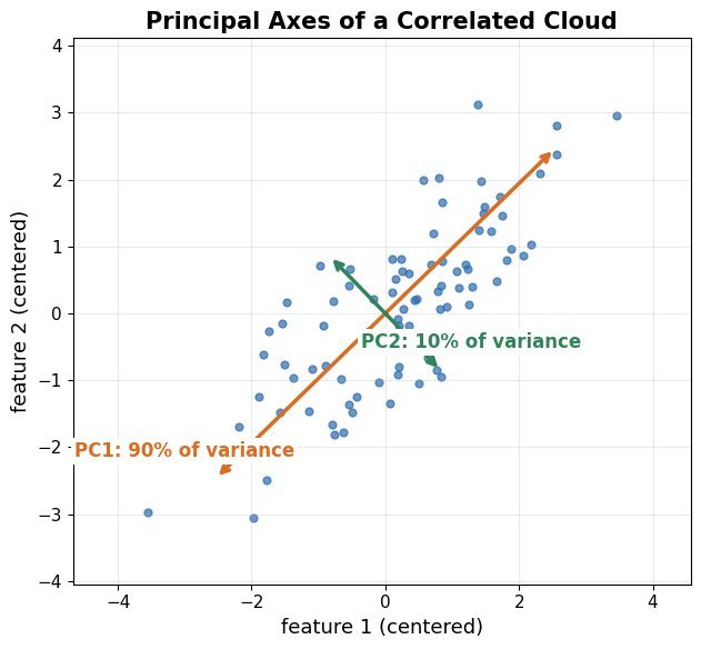
    Two-dimensional elliptical point cloud with the first principal component arrow along the major axis and the second along the minor axis

    Figure 1: The two principal components of a 2D cloud: PC1 lies along the direction of maximum spread and carries the largest eigenvalue; PC2 is orthogonal to it and mops up the residual variance.

    Mathematical Formulation:
    \Sigma = \frac{1}{N} X^{\top} X \ \ (\text{centered } X)
    \Sigma v_j = \lambda_j v_j
    z_i = V_k^{\top} x_i

    Where:

    • X is the centered data matrix with N samples and d features; \Sigma is its d \times d covariance matrix.
    • v_j, \lambda_j are the eigenvector-eigenvalue pairs of \Sigma, sorted by descending \lambda_j.
    • V_k stacks the top k eigenvectors and z_i is the k-dimensional score vector of sample x_i.
    Scree plot: bars of per-component variance falling off, with a cumulative explained variance line crossing the 95 percent mark

    Figure 2: The scree plot: bars show the variance each component carries and the curve shows the cumulative share. Keeping components up to the 95% crossing is the standard rule for choosing k.

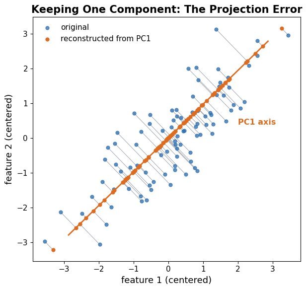
    Projection is lossy: the discarded components carry the remaining variance, so projecting back into the original space reconstructs the data only up to the kept subspace. In 2D this means every point collapses onto the PC1 line when only one component is kept, which is the geometric picture behind “95% of variance retained”.

    Point cloud with each point connected by a thin line to its perpendicular reconstruction on the principal component axis

    Figure 3: Reconstruction from one component: every point is replaced by its perpendicular projection onto the PC1 axis. The gray connectors are the reconstruction errors, whose mean squared length is exactly the discarded variance \lambda_2 (their sum is N \lambda_2).

    FeatureEigendecomposition of CovarianceSVD of the Data Matrix
    InputThe d \times d matrix \SigmaThe centered N \times d matrix X directly
    Numerical StabilityForming X^{\top} X squares the condition numberStable: never materializes X^{\top} X
    ScalabilityFine for small dRandomized SVD scales to huge N and d
    PracticeTextbook derivationWhat libraries (scikit-learn) actually call

    Login to view more content
  • ML0043 Feature Scaling

    Walk me through the rationale behind Feature Scaling in machine learning.

    Answer

    Feature scaling is a fundamental data preprocessing step that normalizes or standardizes the range of numerical features, so all features contribute equally to the model. It leads to faster convergence, improved accuracy, and better overall performance, especially for algorithms sensitive to feature magnitudes or based on distance calculations (e.g., SVM, KNN), where an unscaled large-range feature would overpower the others.

    (1) Definition: Normalize or standardize input features so they sit on a similar scale.
    (2) Why Needed: Many ML models are sensitive to feature magnitude; scaling prevents dominant features from overwhelming the rest purely because of their units.
    (3) Two Common Methods: Min-max scaling maps features to a fixed range (usually [0, 1]); standardization (z-score) centers features to mean 0 and standard deviation 1.

    Three scatter panels showing the same dataset as original features, min-max scaled to the unit square, and standardized to zero mean unit variance

    Figure 1: The same 100 samples under the two scalings: the original features live on incompatible scales (Feature 1 in [0, 100], Feature 2 around 1000); min-max compresses both axes into [0, 1]; standardization centers the cloud at the origin with unit spread. The shape of the point cloud is preserved: only the units change.

    Mathematical Formulation:
    X_{\text{normalized}} = \frac{X - X_{\text{min}}}{X_{\text{max}} - X_{\text{min}}}
    X_{\text{standardized}} = \frac{X - \mu}{\sigma}

    Where:

    • X is the original feature value.
    • X_{\text{min}} and X_{\text{max}} are the feature’s minimum and maximum in the training data.
    • \mu and \sigma are the feature’s mean and standard deviation in the training data.

    Login to view more content
  • ML0038 Validation and Test

    What are the key purposes of using both a validation and a test set when building machine learning models?

    Answer

    The validation set and the test set play two different roles that must not be merged: validation guides every development decision, the test set is touched exactly once for the final unbiased verdict. During development you use the validation set to tune hyperparameters (learning rate, architecture, regularization), select among candidate models, and monitor overfitting (e.g., for early stopping): it is the “unseen” data you are allowed to peek at repeatedly. But because those repeated peeks gradually fit your decisions to the validation set, its score becomes optimistically biased. The test set therefore stays locked away until the model and all its settings are frozen: evaluating on it once simulates real-world performance on genuinely unseen data and guarantees no information from it leaked into any modeling choice. Using the validation set as the test set destroys that guarantee; with very scarce data, rigorous cross-validation during development is the acceptable compromise.

    (1) Validation Set: Tunes hyperparameters, selects models, watches for overfitting: the decision-making dataset.
    (2) Test Set: One-shot final evaluation of the frozen model: the unbiased estimate of real-world performance.
    (3) Separation Why: Repeated validation peeking biases its score; only an untouched set can certify generalization.

    Workflow of training set fitting candidates, validation set selecting the best, and test set used once for the final score

    Figure 1: The role of each split: the training set fits many candidates; the validation set is queried repeatedly to tune and pick the winner (feedback loop); the test set is used exactly once, after everything is frozen; no arrow leads back from it.

    Mathematical Formulation:
    \hat{\lambda} = \arg\min_{\lambda} \; \mathcal{L}_{\text{val}}\big(\hat{\theta}(\lambda)\big)
    \hat{\theta}(\lambda) = \arg\min_{\theta} \; \mathcal{L}_{\text{train}}(\theta; \lambda)
    \text{Final estimate:} \quad \mathcal{L}_{\text{test}}\big(\hat{\theta}(\hat{\lambda})\big) \quad \text{(computed once, model frozen)}

    Where:

    • \theta are model parameters fitted on the training set; \lambda the hyperparameters chosen on the validation set.
    • \mathcal{L}_{\text{val}} is optimized indirectly through many modeling decisions, so it underestimates true error; \mathcal{L}_{\text{test}} enters no optimization and stays unbiased.

    Login to view more content
  • ML0020 Data Split

    How to split the dataset?

    Answer

    A dataset is typically split into three parts. The training set is used to fit the model: it learns the patterns and relationships from this data. The validation set is used during development to tune hyperparameters and compare model configurations, which prevents overfitting the training data. The test set is touched only once, for a final unbiased evaluation on completely unseen data: an estimate of real-world generalization. Typical ratios scale with dataset size: for small datasets (fewer than ~1,000 samples), 60–70% training / 10–15% validation / 15–25% test, with k-fold cross-validation strongly recommended because small validation estimates are noisy; for medium datasets (1,000–100,000), a common starting point is 70–80% / 10–15% / 10–15%; for large datasets (over ~100,000), even 98% / 1% / 1% leaves plenty of validation and test samples. For imbalanced data, use stratified splits so every part keeps the original class proportions.

    (1) Three Roles: Train fits, validation tunes, test judges; each set answers a different question.
    (2) Size-Dependent Ratios: Small data needs more training share plus cross-validation; big data can spare 1–2% for evaluation.
    (3) Stratification: Preserve class ratios in every split when classes are imbalanced.

    Train validation test split ratios for small, medium, and large datasets

    Figure 1: Split ratios by dataset size: the smaller the data, the larger the training share (and the more you need cross-validation); big data can evaluate on 1–2%.

    Mathematical Formulation:
    D = D_{\mathrm{train}} \cup D_{\mathrm{val}} \cup D_{\mathrm{test}}
    D_{\mathrm{train}} \cap D_{\mathrm{val}} = D_{\mathrm{train}} \cap D_{\mathrm{test}} = D_{\mathrm{val}} \cap D_{\mathrm{test}} = \emptyset

    Where:

    • D is the full dataset, partitioned into three disjoint subsets: no sample may appear in two roles.
    • D_{\mathrm{train}} is the training set used to fit the model parameters.
    • D_{\mathrm{val}} is the validation set used to tune hyperparameters and trigger early stopping.
    • D_{\mathrm{test}} is the test set, used exactly once for the final unbiased estimate; reusing it for tuning silently turns it into validation data.

    Login to view more content
  • ML0019 Imbalanced Data

    How to handle imbalanced data in Machine Learning?

    Answer

    Imbalanced data (where one class greatly outnumbers the other) skews models toward the majority class and must be handled deliberately. Five complementary techniques: resampling the dataset, by oversampling the minority class (e.g., SMOTE or ADASYN, which synthesize new minority points) or undersampling the majority class; data augmentation to create additional minority variants; class-weight adjustment, assigning a higher misclassification cost to the minority class during training; metric selection, evaluating with precision, recall, F1, or AUC-ROC rather than accuracy, which is misleading under imbalance; and algorithm selection, using specialized learners such as Balanced Random Forest or EasyEnsemble, or ensemble methods whose combined models are more robust to skewed classes.

    (1) Data-Level Fixes: Oversample the minority (SMOTE/ADASYN), undersample the majority, or augment minority samples.
    (2) Model-Level Fixes: Class weights in the loss, or imbalance-aware algorithms and ensembles.
    (3) Evaluation Fix: Never trust accuracy here; measure precision, recall, F1, or AUC.

    Imbalanced class distribution and SMOTE synthesizing minority samples

    Figure 1: Left: a 9:1 class imbalance. Right: SMOTE creates new minority points along the segments joining existing minority neighbors instead of duplicating them.

    Mathematical Formulation:
    x_{\mathrm{new}} = x_i + \lambda \, (x_{zi} - x_i), \quad \lambda \sim U(0,1)
    \mathcal{L} = \sum_{i} w_{y_i} \, \ell\big(f(x_i), y_i\big), \quad w_{c} \propto \frac{1}{n_c}

    Where:

    • x_{\mathrm{new}} is a synthetic minority sample created by SMOTE.
    • x_i is a minority sample and x_{zi} one of its nearest minority neighbors; \lambda is uniform in [0, 1], placing the new point somewhere on the connecting segment.
    • w_{y_i} is the per-sample weight from the class-weighting scheme; \ell is the per-sample loss and f the model.
    • n_c is the number of training samples of class c: the rarer the class, the higher its weight.

    Login to view more content