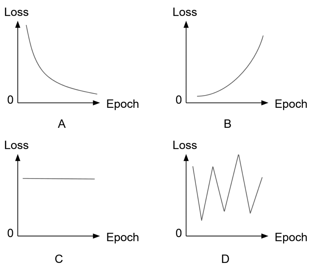
The following training loss curves were produced under four different experiment settings. Which curve most likely corresponds to a correct training setup, and what does each of the remaining curves indicate?

Figure 1: Training loss curves recorded under four experiment settings (A–D). Only one reflects healthy training.
Answer
Curve A most likely corresponds to a correct training setup: the loss drops quickly in early epochs and then flattens as the model converges, which is the signature of steady learning with a well-tuned learning rate. Curve B, where the loss increases monotonically, indicates divergence: typically a learning rate far too large or a sign error in the loss or gradient. Curve C stays flat, meaning the weights are barely updating: a near-zero learning rate, broken gradient flow, or frozen parameters. Curve D oscillates sharply, the classic symptom of a learning rate too high for stable descent, so the optimizer keeps overshooting the minimum.
(1) Healthy Curve: A smooth, rapid decrease that levels off toward a floor, showing that gradients flow and the step size is well tuned.
(2) Failure Signatures: Rising loss means divergence, flat loss means no learning, and violent oscillation means unstable steps.
(3) First Knobs To Turn: Check the learning rate first, then gradient flow (vanishing or exploding), then the loss wiring itself.
Mathematical Formulation:
Where:
denotes the model parameters at epoch
, and
is the final epoch.
is the learning rate, the single hyperparameter behind curves B and D in most real failures.
is the gradient of the training loss
; if it vanishes or is disconnected, the curve goes flat as in C.
is the approximate floor the loss converges to, above zero in practice because of label noise and mini-batch variance.
Leave a Reply