
What is the ROC Curve, and how is it plotted?
Answer
The ROC (Receiver Operating Characteristic) curve is a graphical tool for evaluating a binary classifier by plotting the true positive rate against the false positive rate at every classification threshold. Because models output scores rather than hard labels, a threshold decides what counts as positive; sweeping that threshold from strict to lenient traces out the curve. To plot it: train the binary classifier, generate probability scores for the positive class, compute TPR and FPR at many threshold values, then plot TPR versus FPR. Reading the curve: points near the top-left corner mean high TPR with low FPR: excellent performance; the diagonal is random guessing; curves below the diagonal are worse than random (and can be flipped to beat it); a perfect classifier sits at the single point (0, 1).
(1) Axes: Y is TPR (recall, sensitivity); X is FPR (1 − specificity); both sweep with the threshold.
(2) How It Is Built: Score the data, then recompute the confusion counts at every candidate threshold and connect the points.
(3) Reading It: Closer to the top-left corner is better; the diagonal is random; (0, 1) is perfect.
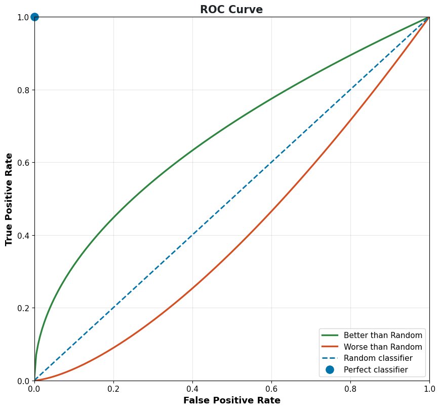
Figure 1: Reference ROC curves: the further a model bows toward the top-left corner, the better it ranks positives above negatives.
Mathematical Formulation:


Where:
 is the classification threshold; varying it from 1 down to 0 traces the curve.
 ,
,  ,
,  , and
, and  are the confusion-matrix counts at threshold .
 is the true positive rate (same as recall) and
  is the false positive rate, the curve’s two axes.
 is the classification threshold; varying it from 1 down to 0 traces the curve.
 ,
,  ,
,  , and
, and  are the confusion-matrix counts at threshold
  is the true positive rate (same as recall) and
  is the false positive rate, the curve’s two axes.
 during training so no adjustment is needed at inference; the alternative standard dropout scales the weights by
  at inference instead.
 of activations per training step; the dropped set changes every step.


 is the scaled activation of neuron
  actually passed to the next layer during training.
 is the original activation of neuron
  is the binary dropout mask: 1 keeps the neuron, 0 drops it.
 is the keep probability, and dividing by it is the inverted-dropout scaling that keeps
 ![\mathbb{E}[\tilde{h}_i] = h_i](https://s0.wp.com/latex.php?latex=%5Cmathbb%7BE%7D%5B%5Ctilde%7Bh%7D_i%5D+%3D+h_i&bg=ffffff&fg=000&s=2&c=20201002) .
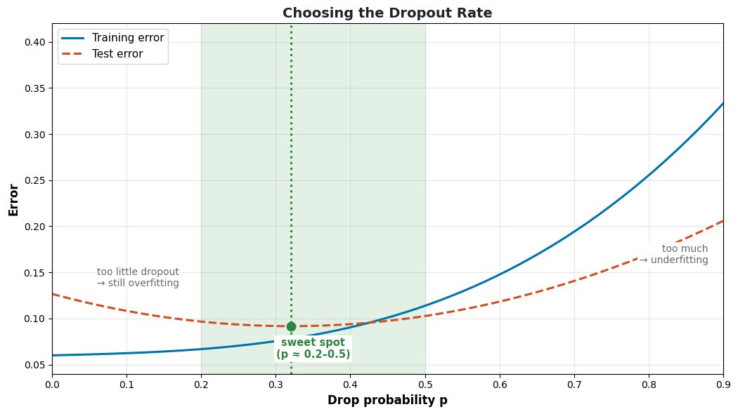
.
 equal folds, the model is trained
  folds with the remaining fold held out, and the final score is the average over all
  or
or  is the default, LOOCV suits tiny datasets, stratified folds suit class imbalance, and TSCV is mandatory for sequential data.


 is the cross-validation score, the average error across all
  is the validation error on fold
  indexes the folds.
 is the model trained on all folds except fold
  is the held-out fold.
 is the evaluation loss or metric (e.g., error rate, log-loss).
 directly, mapping features
  to labels
  without modeling how the data was generated. Examples include logistic regression, support vector machines, and neural network classifiers. Generative models instead estimate the joint probability
  (via
(via  and
and  ), capturing how the data itself is generated, and then use Bayes’ theorem to derive
  .
.


 is the predicted label and
  is the evidence normalizer, computable as
  over all classes.